

Altair Eyewear
Corporate rebrand

Challenge and strategy
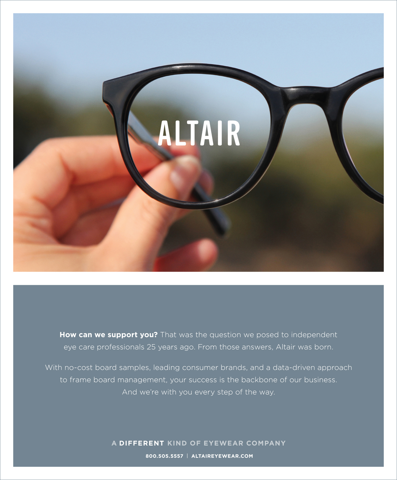
Altair Eyewear is a company created for doctors, by doctors, with an innovative approach to frame board management, offering eyewear products via a consignment model, unique in the industry. The goal was to excite the Altair team with a new elevated design, look & feel, and brand voice that conveyed the authentic and warm yet professional personality of the family product line.
Altair needed a refresh from the ground up, from the dated logo and color palette with a modern, friendly, and agile brand system, reflecting the core values and modern, forward thinking approach to how we do business. I surveyed and interviewed key stakeholders to gather tone, look, feel, target market. With a strategy in place, it was time to concept.
Makeover time!
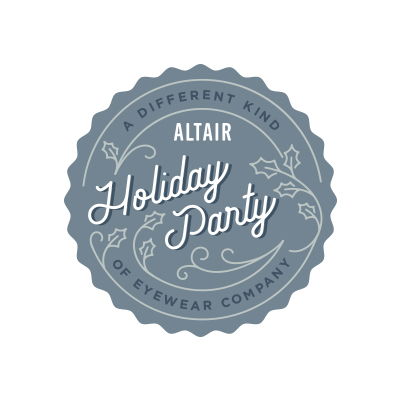
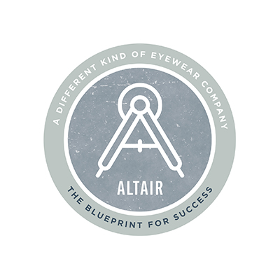
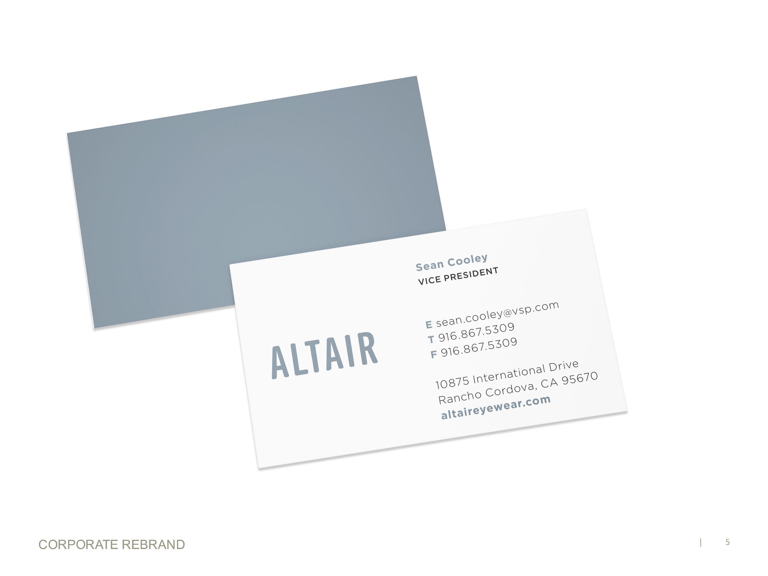
The new corporate logo reflects the laid back personality of Altair. Leadership was set on something reminiscent of the California license plate, so to avoid being kitschy, I landed on a font called Trade Gothic Condensed Rounded—sure to not date itself quickly like several of its predecessors, but appears to be a modern iteration of the letterforms on our license plate. Also, it needed to be flexible enough to shrink down as small as on the temple of a frame, and clean enough to work nicely with logo lockups…which leads us to the eyewear iteration of the logo.


A unique challenge
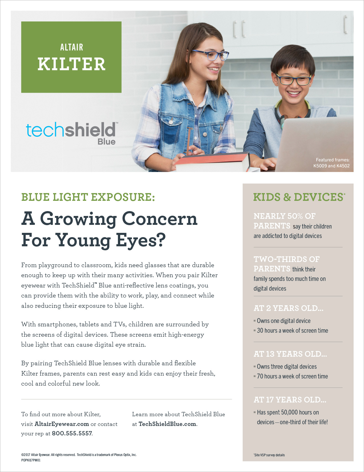
A unique challenge of this redesign is that Altair Eyewear corporate had a proprietary (house) brand of eyewear, allowing opticians great styles without paying the premium of licensed brands. Here’s the glitch: Same name. So I was challenged with creating a sub-brand that was clearly under the Altair corporate umbrella. Differentiated, but not.
Getting on the same page
We needed to create a unified look to instill pride and brand value in the proprietary brands, and leverage the recognition of Altair, creating a visual connection. At right you can see their was no visual relation to each other or Altair, except for Altair Evolution (which didn’t even say Evolution…but I digress). To make the sales pitch easier leveraging the brand equity of corporate, I created a family of brands that integrated the Altair logo, with a fresh new color palette, with complimentary slab serif logotype that unified the system.

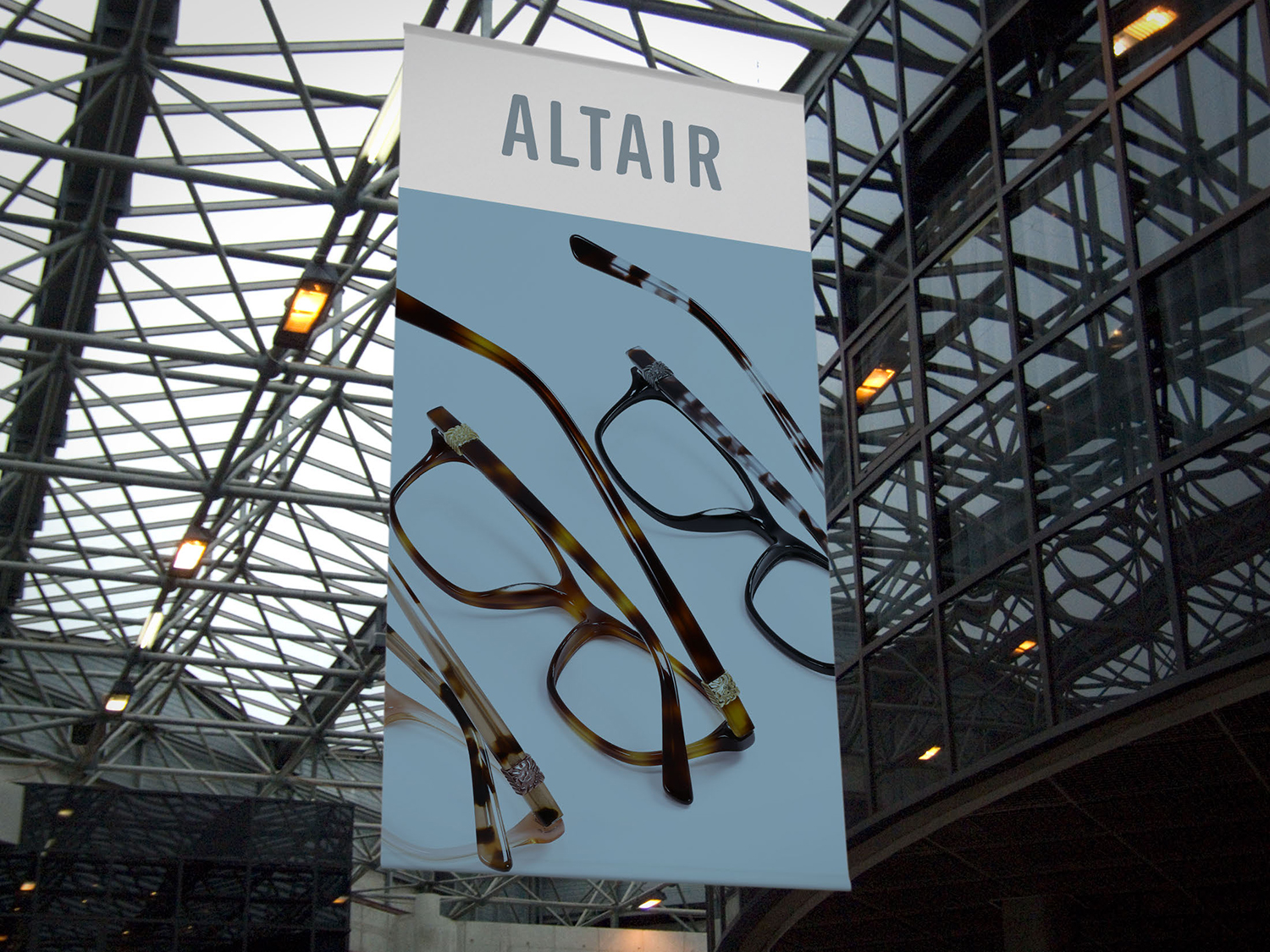
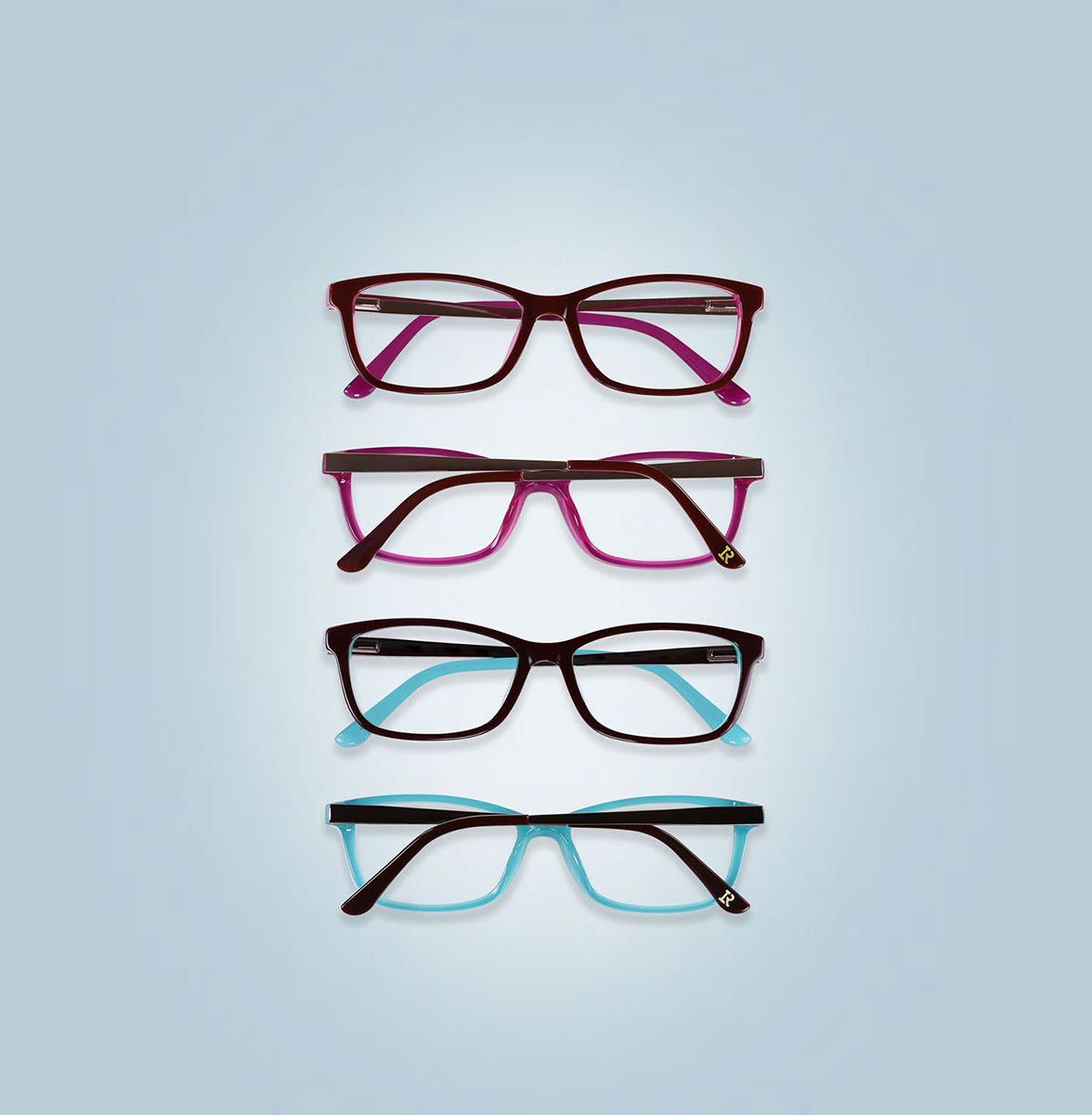
Custom photography for launch


Featured above are pages from the lookbook which launched the new direction to the eyewear industry. The family of brands stood out among the likes of licensed brands like Cole Haan, Joseph Abboud and Anne Klein. The suite now has a unified look, shows clear association to Altair corporate, offering opticians a full collection with something for everyone at a huge savings.


Results
The new unified brand fired up sales and financials were up. Feedback was overwhelmingly positive from the optical industry. I don’t think it’s a coincidence that following year our brand team was able to secure a highly touted new licensed brand. When Draper James launched their eyewear line, they went with Altair Eyewear.
Lenton & Rusby

Challenge and strategy
Create a brand quickly for an affordable private label brand that offers something for everyone in a modern way
Target: 25–55+ customers looking for a second pair or private pay bundle
Design Direction: Sophisticated yet modern and approachable look & feel
Tone: Casual, Trustworthy, Affordable, Friendly, Nostalgic, Stable, Relaxed, Inviting, Modern, Professional
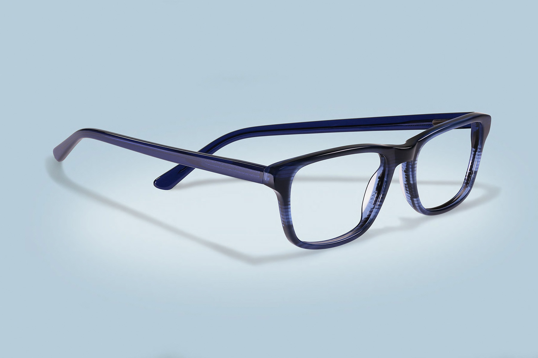
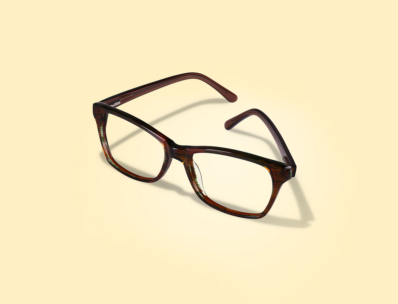
Exploration — on the double!
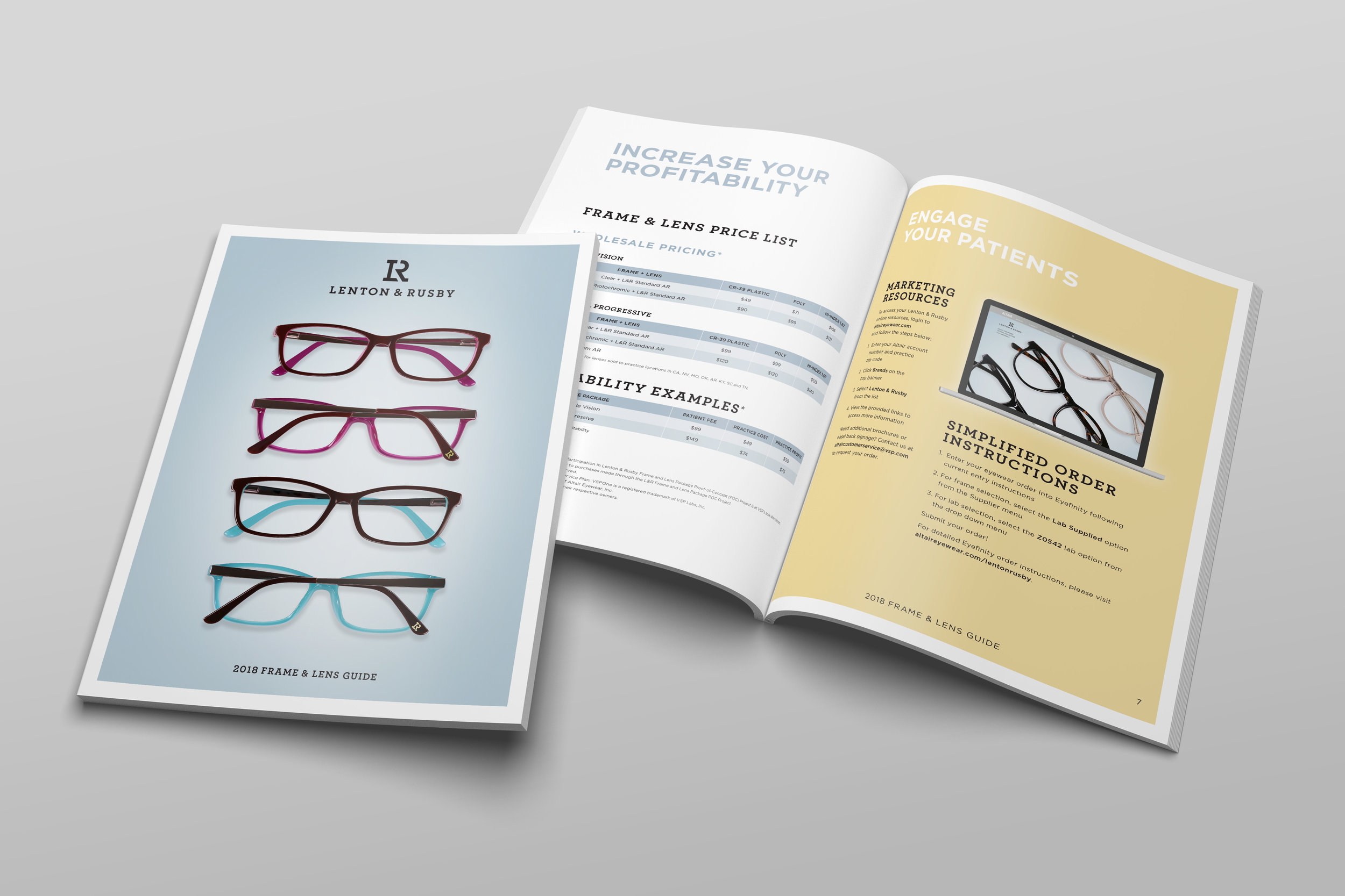
Product was ready and needed to launch fast. I went to work exploring brands, photo directing product imagery, concepting displays, ad concepts. This was for a test concept so quantities were small and budget was nil. Photography needed to before the brand was finalized, so I kept it clean with a fresh, modern color palette. Content was very technical so clear visual communication was of the utmost importance.
And the unanimous winner was…

The friendly warm palette and modern, no-nonsense product photography captured the quality materials and brand promise. The content was heavy on technical mumbo jumbo so the clean design helped convey the messaging as easily as possible.